27 December 2015

István Szőnyi

István Szőnyi
Roofs in Zebegény
circa 1930

     Orange chalk. Powdery, fine, light and dryly-scented. It dusts the parked and cornered roofs in small, discreet mounds, hissing and shifting with low, late evening winds, though remaining seemingly flat to the naked eye. Cypress trees, sage in their study of the ever-evolving sights, sway to a tune of their own, with both ease and aged grace. Thunder, far off beyond the sleeping rocks, ripples nearer like waves of the sky. Wooden rails caked in paint and soil, rain or shine, root and route up and down, in and out. Snuffling and grunting and snorting and huffing, three pigs hoof their hefty way from their left to right, from cart to trough, from day to night. 

20 December 2015

Viennese Bronze

by (unknown); ‘Old Vienna Bronze’
Sheath (empty)
circa 1899 (?)

     A miniature marvel of skilled artistry, balanced aesthetics and simplified narrative combined. Despite its lost other half (was it an envelope-opener? a small knife?), one may easily interpret the sheath’s low-relief imagery with but an open imagination, perhaps revealing the original purpose of whatever once slid within. The Great Horned Owl (known in earlier days as the ‘winged tiger’ of the skies) perched atop the stairwell of perilously-piled tomes may signify the collective wisdom of time, an idea embodied effortlessly by the form of an owl whose calm, innate sense of duty and predatory daring as a species of the hunt reflects the maturity of evolution. The owl may also symbolise the now-rare use of birds as message-deliverers, or the belief that the souls of deceased loved ones may experience reincarnation through the eyes (so-to-speak) of sage, self-sustaining creatures, thus serving as ever-watchful companions over their kin. Even the weather-beaten saying, ‘Birds of a feather’, may apply some value to the sheath. Its upper nib is decorated with what may be seen as a curiously-curled rendition of a six-tailed plume (or might it be a furling, flaying tree?) which, in turn, might suggest the sheath as being one of a pair, or as that which protectively encloses its significant other. The sheath may even be a figurative extension of its owner and the business to which s/he attended with this very sheath (and its missing counterpart). Or, simply, the relief décor may just render the vignette of a sleepy owl, a column of nameless books and a tendril-frenzied shoot eager to lift the former pair into the dreamy, boundless skies - nothing more.

Wright & Teague

Wright & Teague
Octet Ring
circa 2015

     Gently hewn with what easily could have been a minuscule hammer (and handled by an equally minuscule Gnome), the mottled skin of this ocular octet breathes with its own kind of fire. Seemingly Greek in inspiration, its two-fold halo of winking, luminescent jewels gravitates within itself with a tightly-bound energy not unlike that formed between eight siblings, each with a defining character and each with an undeniable need to occasionally prove and outshine the others. Small but prominent, the ring’s every jewel smiles with its own faceted charming confidence, unfazed by the similar attempts of the flanking others to attract if not more praise and attention. Between the ring’s body and its variegated face there is also a particular chemistry that only the medium of gold, whether gilt or pure, can enhance so uniquely and beautifully, making a ring such as this a contemporary art form as well as an ageless testament containing the blood-thirsty, awe-inspiring history behind the discovery of and the world’s ensuing desire for gold. And with the additional fact that the ring’s makers are related to the actress who embodies J.K. Rowling’s wonderful flame-haired character, Ginny Weasley, there unravels a sense of further (albeit quirky) proof that there is indeed a strange kind of fire coursing the veins of this ring. Though whether it is that of the Weasleys’ freckled and fiercely warm-blooded bond as a family, or that of the far-more disconcerting Fiendfyre, its true source remains a mystery. 

6 December 2015

F Ad Richter & Cie.

F Ad Richter & Cie.
‘Zoological Garden’ Tangram
circa 1912 (?)

     A kind of puzzle which requires an appreciation of simplicity and a good deal of innate cleverness, this mint tangram set offers a lovely collection of intricately-composed animals to make. Whether one fancies blocking together the form of a grumpy vulture, an elephant calf or even a fire-breathing rat, the twelve geometrical brick-like slabs allow one to expand beyond the realm of a limited reality and into one of strange and fantastical possibility. Each slab has at least three sides with which to play and match to another’s, an act that relentlessly imposes on one’s imagination (if present) the question of whether the pairing is a ‘yes’ or a ‘no’. Those who enjoyably master a game as this are those who predominantly respond with a ‘yes’ and who do not shy away from the resulting never-before-seen imagery of a creatively opportunistic hand. On the contrary, those who easily find this game frustrating are likely those who lack patience and who frequently respond with a ‘no’, even when presented with a beautiful day on which to leisurely sky-gaze and forage for shy shapes among the clouds. 

Hermès

Hermès (Limoges porcelain)
Coupelle of ‘Marqueterie de pierres d’Orient et d’Occident’
circa 1990s

     Simulating a sinuous piecing together of rippling marbles, earthy granites and other semi-precious stoneware, the flora and fauna fanning across the face of this tray seam to one another so as to create a sweet, nectarous bay in which one may happily pool a little collection of bibelots. The romantic relationship between the colours and shapes of the décor casts a kind of ceaseless, swaying shimmer over the tray in its entirety, occasionally teasing one’s sight with an overwhelming (though beautiful) wave of fiery reds or with one too few blinding, starry specks mottling a sea of blue. And what with its airy, ethereal imagery there lingers an additional factor - one that is felt rather than seen - that makes this coupelle all the more lovely as a work of art: it is the sense of the sturdy, firm-footed weight of the porcelain, something that eludes to durability and confidence and something that, in this case, pleasingly counterbalances the floating snail, wooden leaves and bashful, one-eyed green worm with an unwavering hand, keeping safe those who play innocently and naïvely within its sloped confines.

22 November 2015

Vilmos Perlrott-Csaba

Vilmos Perlrott-Csaba
Portrait of Sándor Ziffer
circa 1908

     A refreshingly candid conveyance of a man. Name, age or creed aside, the subject stares relaxedly and unconcernedly into our anonymous eyes as well as into those of his portraitist, rather like one sitting on a bench while only mildly aware of the seamless haze of strolling passerby’s and of the intermittent rustling of leaves. Though seated indoors, in full dress, on a lavish velvet-lined (perhaps) and plush canapé, the man’s posture suggests a space in time that is transient, unfixed. His off-centred position within the picture’s frame, as well as the tri-panelled rose-flecked backdrop curiously ‘crowning’ his topped head, subtly impose on the scene a questionable sense of surrealism. Nothing is seen in its entirety, save the figure’s black hat, which may be interpreted (among many ways) as an invitation into a baseless, boundless space of dreamy creation and possibility: the crimson-covered bed, a glorious thing in which the subconscious takes flight, floats in the upper left-hand corner and is only semi-exposed to the audience, somewhat like a ‘wink’; the patterned wall-paper shimmers gaily with the dancing faces of many blooming, bulbous buds, though without the proof or surety of being attached to either a floor or a ceiling; and the man himself rests on an expanse of floral reds and murky greens that also reveals no evidence of being footed on a floor, or indeed of having any ends. Though these may be details of no importance, drawing attention to their presence nevertheless sheds light on whether they have a capacity to contain more than one meaning. Their roles may truly be one-dimensional and stationary, as seemingly intended, or they may in fact be separate keys into the thoughts of Sándor Ziffer - of a man, of a human being.

15 November 2015

Leafing Through la Maison Zimmermann

la Maison Zimmermann (Paris)
an Illustrated Promotional Leaflet (partial)
circa 1914

     Folded and overlaid rather like an accordion (albeit a tuneless one), the pages of this leaflet feature six charming illustrations by Gets (?), each charismatic and uniquely militant on the bare stretch of page it stands. The selected pair (as seen to the left) adorn the leaflet’s cover and back faces, with the remaining illustrations within combined to create a one-registered conversational storyboard - or, in fact, an open letter - between a certain ‘Madame de Villepré’ and her nameless granddaughter. Their ‘conversation’ so-to-speak (cleverly acting as the invitation to the house’s opening event), is not a particularly long one, though it coincidentally serves as the footstool on which the fashionable hoop-hemmed, whimsically frilly works by la Maison Zimmermann are artistically showcased. By example, a polka-dot-clad lady unwisely (though apparently) harpooning a wonky parasol illustrates the caption (translated), The look of, ‘Come hither, young man’, while simultaneously sporting a ghastly great pair of ankle-grazing knicker bottoms. Even by last century’s standards of seduction, surely an à la mode garment such as this acted to repulse rather than lure in the opposite sex (especially in light of the lady’s curious behavioural ‘love call’), but nevertheless, the illustration’s candour (and that of its brethren) remains obstinate: it embodies the house’s lucid style of eloquence, its cheeky play with humour and its appreciation and support of the work of an artist who knew how best to balance petit, quaint drawings with the often mis-used vernacular of negative space. This leaflet speaks warmly and poetically on behalf of la Maison Zimmermann, though certainly not by way of words.

8 November 2015

Private (Miniature) Savings

by (unknown)
a ‘Coal Bucket’ Savings Tin
circa 1953 (?)

     For whom could this have been made? Judging by the illustrations painted (or printed) along its main panels, one may assume that, in response, the tin was created for someone with an appreciation of small, delicate and ever-growing, self-sustaining things. On the tin’s shouldering panels flower two mirrored groups of bright-faced sunflowers on whose great thick leaves crawl a ladybird or two. Though crudely (or rather clumsily) painted, the flora and fauna form an image of solidity within a quiet, un-obtrusive realm of calm repetition and comfort; Nature is present always, even in the harshest of places such as coal mines and synthetic fields of manufacture, and it is for this reason that, perhaps, the tin’s maker chose to couple two such paradoxical themes in order to extract and pursue a sense of renaissance from the ashes of human exploits. It is simultaneously a light- and heavy-hearted act of symbolic pairing, and twisted within these lines is an actual twist - that of the bulrush-clinging dwarf who, apparently, is attempting to distract the peaceable frog down below with his mischievous five-fingered caterwauling. From hope and imagination stems possibility; from but a drop of water and a flow of relentless care stems growth; and from a steady, tireless dedication in the collection of one’s savings there stems, undoubtedly, a ‘growth factor’ (so-to-speak) of independent personal stability, no matter from how small an amount it may first begin to blossom. The dwarf knows this, and woe betide his stubborn stout listener should he ever stop trying to convince the frog of this fact.

1 November 2015

the Wiener Werkstätte: Remigius Geyling

by (designer) Remigius Geyling
a Ceremonial Ball Donation
circa 1911

     Designed in honour of ‘the city of Vienna’ and ‘Wilhelm Melzer’ (as inscribed), this squat four-legged oval jewel shares a great aesthetic resemblance with the makings of the Wiener Werkstätte. The visual perception of the box’s weight relies much on the relationship of its proportions: emphasis is placed on the delicacy of its minuscule feet by way of being shadowed under the box’s low-slung, wide belly, while the belly itself boasts of a supposed ‘inner’ strength and definitive solidity of form when, in fact, its bowels are spacious. The language of this type of artistic relationship is idiosyncratic of this period in time, when durability and stamina were defined by the quality of contouring and decorative concentration found on an object of art. Pieces made by those involved in the Wiener Werkstätte are heavily imbued with this value, wherein details such as colour, texture and form are combined to embrace the Gesamtkunstwerk, or the ‘total work of art’, so as to advocate the marriage of artist and creation into a single entity. A direct fruition of the Viennese workshop(s’) core ideals, this box remains a sturdy individual of turn-of-the-century craft, with its four rice-grain limbs acting to support a weight both immeasurable and eternal on the face of history.

25 October 2015

19th Century Jewellery: the Silver African

French Colonial Algeria (Third Republic)
a Handcrafted Hinge-and-Latch Silver Bracelet
circa 1892 (?)

     For those who keep out a sleeplessly strained and hungry eye for high-quality jewellery, this bracelet classifies itself as an authentic prize of pure hand workmanship, with more than one hundred years of age incised into its fluid skin. Compared with others of its kind, this piece likely originates from the hands of a French crafter situated in late nineteenth century Northern Africa rather than from one of the many jewellery-designing natives practising at the time. Not unlike Algerian tribal jewellery similarly hewn from silver, the bracelet’s particular style of repetitive ‘fish scale’ grooving and shallow inner notching nonetheless defines its maker’s inspiration as being indirectly reflective of local decorative tradition. Its figure is somewhat more shy and streamline in unity than its indigenous silver siblings (many of which boast of bold heavy clefts and glorious additional ornamentation in the forms of 'egg' bells and chains), hinting of a subtle influence stemming from Northern and Eastern territories. A collective joint of wide-spread turn-of-the-century tastes, this bracelet’s core stretches between Spanish, Algerian-Moroccan and even Indian aesthetics - with this being the reason for which I fashioned its new gold-and-silver latch [once missing] a singular clawed brass bell, a classic of India.

18 October 2015

the Augarten Porcelain Manufactory: Döbrich

by (designer) Albin Döbrich; produced by A.P.M. (Vienna)
a Handpainted Porcelain Fennec Fox
circa 1911 (?)

     For a creature so small and sweetly meek, porcelain preserves perfectly the Fennec’s character. Unlike appearances, this species of fox can be surprisingly loud and boisterous when either excited or angry, usually piercing one’s eardrums with a high-pitched, drawn-out squeak that is more likely to come from a crabby, bad-tempered door mouse than from anything larger. The delicacy of milky white lining this Fennec’s coat emulates the natural sheen of its realistic counterpart, with the watery brown touches flecked along its muzzle, forehead, ears and back simulating, perhaps, its softest parts. Its fur is also enormously fluffy along its inner ears, acting as a kind of naturally-insulating muffler for the sensitivity of the fox’s extra-fine hearing abilities. To some, the Fennec may be too funny-looking and queer to be taken seriously as a true fox, but criticism and empty teasing matter little to its kind - the Fennec has ears for only bigger and better things.

11 October 2015

James Mont

by designer James Mont
a Carved Oak and Bamboo End Cabinet
circa 1954

     With its strong segmented face, curved, linear and cycloptic, and with its gentle grey-blue, silver-browed and mottled skin, this one-of-a-pair work stands as monumental in stature as l’Arc de Triomphe itself, though in miniature. Recently swathed in renewed polish and re-touchings, the cabinet’s figure dominates the space with a steady, firm-footed confidence fit to elegantly wing (rather like a shoulder pad) the side of any equally charming bed, desk or canapé, independent of whether the styles of the furniture match or not. Designed to appear nearly solid, with its silhouette slim of any suggestion to its cavernous insides, this piece in fact houses an upper (frowning) drawer and a hinged, circular-handled doorway, each giving way to handsome and dark inner linings of bare oak. And additionally, with each cabinet’s brow leafed in an Edgar Brandt-esque net of framed woven silver, there results an undying shimmer inherent to the cabinet’s outlook - rather as how each dawn and sunset plays with the stone face of l’Arc de Triomphe.

4 October 2015

20th Century Jewellery: the Ring

by (unknown) French (?) jeweller
a Black Opal and Diamond Cluster Ring
circa 1919 (?)

     Auctioned by Christie’s South Kensington in September of 2012, this jewel (both realistically and metaphorically speaking) reached the hammer price of nearly 3’000 British Pounds - only a few hundred shy of its initial estimate. What caught my eye at the time, while perusing the catalogue at hand, is the unusual and breathtaking natural swirling of the cabochon opal’s speckled face. My instant impression was that of the universe, wonderfully bottomless, ordered and dimension-less, being somehow cupped and stirred within the face of our moon, like a sweet and dark cup of tea handled and de-riddled by a mystic or Seer. Crowned with a complete mane of white diamonds, each like a ray of sun collected as a weightless dew drop, the opal face nestles comfortably inside a nearly-blinding scintillation of moist stars, drawing out further the stone’s splattered and stained skies belonging to the outer realms beyond Earth. And with an extra stretch of imagination, the ring’s face  evolves into a curious and wondrous chasm, or an open un-speaking mouth, equal to that of the Indian god Krishna when asked by his mother to prove his innocence against the unwise act of eating soil.

27 September 2015

Paul Poiret: the Perfume, Part II

Paul Poiret
le Catalogue Publicitaire des Parfums de Rosine (cover and page)
circa 1923

     Of this catalogue’s seventeen featured scents by Poiret, the compositional layout of le Mouchoir de Rosine (right inset) is, in opinion, one of its finest. The columnar arrangement of text and image, as well as the choice of dainty, effeminate typeface, exudes on behalf of the perfume the sense of an unfussy and to-the-point character, fiery red (though discreet) in determination and stature. The perfume’s deep orange casing itself, while unopened, stands tall with prominence and solidity, rather like a miniature Greek pillar fit to leg any great monument heralding a goddess. With its top off, the casing’s base transforms into the gilt pedestal of a wonderfully crafted bud of tissued flame, or indeed a plume of satin petals, inside of which is no doubt wrapped the precious flask of le Mouchoir. Floating to the left of the photograph and its supporting description is a monochromatic illustration of two flower heads, each cleverly mirroring the shape of the blossom-like tissue assemblage in the photograph while also drawing a visual parallel between the catalogue’s cover page (left inset) and those which follow, and therefore allowing a continuous and uninterrupted flow of reading ease. In all, there is a dreamy quality which delicately saturates the pages of this catalogue, whether seen as a whole or, as in this case, seen only by a page. Nearly one hundred years on this quality remains, hovering as a mist over leaves of paper and ink slowly fading with the inevitability of time.

20 September 2015

the Wiener Werkstätte: Vally Wieselthier

Vally Wieselthier
Tobacco Box (ceramic)
circa 1922

     This artist’s œuvre is recognised by its long ‘swimming’ figural pieces, sometimes independent in dimensions (such as single elongated female heads) while at other times integrated as reliefs (usually high) on functional objects, such as ash trays and dishes. This tobacco box, by chance, features a low-relief registry of Wieselthier’s lovely pipe-chorkling characters, each floating in its own bubble of two-dimensional existence along with curling trundles of spindly budded foliage. Left unhinged and unfinished within, the box’s lid lifts off completely to reveal a chalky and almost brick-like grainy interior, raw in simplicity. The box’s feet and edges, however, are boldly painted in a simulated watercolour palette of deep runny blues, with the darkest concentration settling, naturally, at the bottom along the undulating and rococo-esque hemline. A definitive part of the Wiener Werkstätte ‘look’, Wieselthier's style defined one of the movement's main supportive pillars with a well-rounded edge of acceptance of the beauty found in willowy dancing figurines.

13 September 2015

Freywille Foundations

Michaela Frey Team
Tropic Rosa Parrot Bangle
circa 1976

     Today known as Freywille, this esteemed Austrian jewellery house was originally recognised as ‘Michaela Frey’ or ‘Michaela Frey Team’ between the years 1951 and 1980, headed solely by its founder, Michaela Frey, until her passing away. Her iconic gold, frosted black and enamel bangles, such as this mint piece featuring chirruping blue and yellow parrots, are much sought after today as collectibles of Frey’s unique handling of sophisticated colouring and imagery as well as of the high level of craftsmanship individually exhibited through the structure of her whimsical and often historically-influenced compositions. At one point additionally designing enamelled bangles for Hermès (hence the similarities and resulting confusion), Frey continually expanded her own line of initial and irreplaceable ‘Freywille’ pieces which remain, then and now, as miniature testimonies of inherent class that, if unexpectedly stumbled across in a flee market or boutique, give way to instant happiness to the trained eye.

Thakoon Resort

Thakoon (Panichgul) Resort 2016
Look no. 12 (Iris-print dress)
(2015-16)

     This is, quite simply, a lovely creation fit for the form of a contemporary lady. It embodies every crucial style credential to which many flitting fashions attempt to adhere, but at which they usually fail. Framing the womanly shape (whether of a curvaceous, lean or slim nature) in an easy-on-the-eye, peek-a-boo japonisme-esque screen of irises, this dress dually overlays the seductive with the conservative by way of its smooth contours and pleated light-hearted airy material. It is a piece that may be worn no matter the weather, the occasion or the time of day, with its monochromatic vernacular acting to define it as a garment that undermines any so-called customs dictating which season may or may not call for certain types of clothing, and that instantly veils the body in an edgeless, glowing elegance that even a pair of dulled and dirtied trainers could not detract from. Proudly a piece of the present, this dress is of a quality that not only reigns highly in its current fil, but also in the relentlessly unchanged truth behind true and ageless style.

30 August 2015

Attilio Mussino

Attilio Mussino
Illustration for ‘Pinocchio’
circa 1911

     Little parallels, let alone excels, the illustrations that Mussino created for Carlo Collodi’s timeless tale of Pinocchio. In comparison with works by others, whether by those from the past or by his contemporaries, Mussino’s drawings exude a character of form and expression yet unrivalled as visual vestiges into the world of Collodi’s wooden marionette. Through dark contours, the choice of only a few colours and, of course, his own lovely simplified style of illustration, Mussino enlivened the mischievous peg-and-timber character with an equivalent sense of ‘birth’ to an otherwise inanimate object as do the actual words written by Collodi himself. Other attempts by various artists into achieving this equal relationship between (a) story and (its) pictures only resulted (by popular opinion) in a rather deadened, lethargic look to Pinocchio - or rather a Pinocchio drawn with little appeal to the imaginative thirst nearly all children seek from such magical tales as this. Mussino drew with the intention to tell rather than to impress his viewers of who Pinocchio is. He avoided drawing additional background  ‘noise’ (such as far-off trees, an indistinct butcher’s shop or perhaps a lone goose) or any extra flourishes to the important aspects of the narrative itself because, as any true illustrator can agree, he felt the greatest importance should be in giving the independent voices of the main characters as much room in which to speak for themselves - to communicate their own angle of their written world with as much visual clarity as possible. And by all means, in this particular scene one might easily interpret Pinocchio as saying, High-seated friend or foe, for what it’s worth, why not come down and play?

23 August 2015

Mikhail V. Nesterov

Mikhail V. Nesterov
the Fox
circa 1914

     The light tickling of colours drifting through the air of this scene denote the time of day as indefinite, undefined. It may be mid-morning, early afternoon or, unusual but true, the last rays of fading sun basking down just after a great late evening storm. This sense of the unknown, of what exact hour it might be in which these four subjects exist, offers to the scene an ethereal mood - one that veils the trees, the slow underwater tide and even the individual tufts of dewy, cold grass or the mens’ white whiskers in a fairytale-like aura. One might even deem the air as somewhat misty, veiling further the subjects in a standstill; in a wispy capsule of painted time. 
     Like ever-curious children, the men sit and peer steadily around at their surroundings in such a way that suggests their affection for all that grows and evolves naturally; that which ceaselessly strives against the many turns and currents of humankind; indifferent and unaffected by its moods. Their backs to a stone dwelling (perhaps the far-winged turret of a small church), the three sages sit on the edge of this scene as though representing a ‘side’, the other of which is embodied by the creature facing them, the tip-toeing fox, and by the clustered mesh of mossy trunks. One may gather that, from this, there occurs a welcomed confrontation of the tamed and untamed sides of nature (though which is which?), and that the stretch of middle ground (in which a tree stump harmlessly squats as though a judge) symbolises the platform on which an inevitable examination will at some point be held. For now, there is but a single unseen string of tension hanging somewhere along the horizon - one that, in Nesterov’s perspective, is to be both playful and tumultuous in effect.

16 August 2015

Wartime Dining

by (unknown) Austrian illustrator
New Year’s Eve Dinner Menu
circa 1915

     Held in honour of the ‘Austrian Army of the Field’, this New Year’s dinner made way for a menu featuring not only delicious dishes (including, of course, the irreplaceable Wiener Schnitzel), but also a deliciously quaint illustration. Classically block-printed and slightly blotchy in parts, its colour vignette beautifully portrays an anglicised blue-cloaked figure clutching a pine branch (?) and a slung ribboned wreath, while knocking gently at the door of whomever’s stepped entrance she stands on. From behind her looms a family of poised shadowy trunks, probably those of an Alpine species, with their earthy brown skins adding to the young girl’s wide-eyed glance a heightened sense of the relentless, ever-changing reformation of one’s outer shell that each new year requires. Charged with the complementary presence of Nature herself, the figure seems to knock more brusquely against whatever stubbornly stands between she and her quest, while at the same time looking out to us (to those who seem to follow in her wake) with a silence that says, Why not - what if? At the time, this illustration served as a symbol of hope to those on the final night of December 1914, with the figure’s inviting stance and gentle gestural knocking suggesting, perhaps, the inevitable oncomings of the unseen, the brutal truths and, finally, the recycling of peace - and how one must endure the pain of knocking down doors in order to truly see what lies ahead.

9 August 2015

Paul Poiret for Herrmann Gerson

Paul Poiret (et l’Atelier Martine) for Herrmann Gerson
Raüme von Paul Poiret - Paris (for (une) revue allemande)
circa 1913 (November issue)

     Herrmann Gerson remains one of the notable forerunners of independent German couturier houses of the early twentieth century, with collaborations with contemporary figures such as Paris’ very own Poiret moulding for the house an indestructible image of style beyond the mere superbly-cut lady’s overcoat or gentleman’s evening suit. It is for this reason that the ever-evolving exhibition rooms for Herrmann Gerson, in which each season’s new line was publicly presented, feature in this illustrated bi-monthly (?) national review. The front cover (left) demonstrates the then-current wave of artistic influences washing through central Europe, with a great deal of emphasis placed on tightly-knit meshes of monochromatic pattern and Classical-like Michael Powolny putti taking centre stage. To the right, two photographs (page inset) promote the style of interior décor idiosyncratic of Poiret and his youth-orientated studio, Atelier Martine. Headed by Poiret, the studio was encouraged to incorporate into its textiles and similar creations his aesthetic-based admiration of nature. Firecracker-like blossoms, Fauvist-like colours and seeping, creeping shapes (such as the painted vine tendrils swaying along the walls and nearly tickling the ceiling) all swarm as one thriving entity despite their separate purposes and functions as either curtains, wall designs or even silk foulards. In this particular instance, the pairing of vibrant, avant-garde fashion pieces of Herrmann Gerson with Poiret’s touch of domesticated wildlife certainly imbued a distinctively new taste into the commonly misunderstood meaning behind ‘à la mode’.

the Wiener Werkstätte: Arnold Nechansky

Arnold Nechansky
Frohe Ostern! (Postcard no. 794)
circa 1912

     Classically elongated, from the typeface to the egg and the gazelle-like duo, Nechansky’s style enunciates its subjects with an elegant flow of form. The individual components of the illustration are drawn to simulate each others’ visual vernacular, enabling each one (with a bit of imagination) to ‘sidle’ into the two-dimensional skin of another, therefore uniting the design completely and without interruption. The letters, for example, mirror the forms of the ladies, while the ladies themselves precariously perch with a slim featheriness that echoes that of the F all the way to the !. Even the red eggshell, cradled by the woman in white, creates one of the three stepping stones helping to draw the eye smoothly across the postcard, beginning naturally with the uncoiling of beaded necklaces at the top; followed by the great yawning central ‘O’ (perhaps acting as the woman’s seat cushion); and circling (or might one say ‘oval-ing’?) right down to the standing woman’s balloon-like pouffe, only to draw the eye back once more to the top - to begin again, as one should (thrice) on Easter Day.

26 July 2015

Cristobal Balenciaga

Cristobal Balenciaga
Striped Taffeta dress
circa 1945

     A marvel of understated casual class. Swathing the female frame in sweeping, slightly sloping stripes, the structure of this day-wear dress acts to strengthen and elongate a lady’s gestures (and especially her strides) with but a flit and a flutter of the uncanny texture of taffeta. With just a step or a readjustment of the leg, the folds of this type of textile pleasingly chafe alongside one another with a crisp vigour to match the boldly stretching and yawning stripes throughout. And as a ribbon would securely clutch together the stems of a bouquet of striated tulips, so does the satin belt nip the waist of this seemingly many-petaled creation, leaving at liberty the drooping sleeves to sway with natural ease.

19 July 2015

Vestiges of Vietnam

by (unknown) Vietnamese jeweller(s)
Pair of silver and wicker floral-motif bracelets 
circa 1909

     In terms of creating a bracelet, it is an aesthetically clever (albeit difficult) stroke of design to combine, all in one, the elements of lucidity, obstinacy and elegance. Of the former, there lies in the two half-way joints of either of these bracelets a seamless ‘visual’ soldering of wood and metal. Without a true understanding of the different tensions and malleabilities inherent to such opposite natural materials, the four joints of this pair would not stand out to be as lucidly circular or as seemingly of the same ‘core’ as, perhaps, intended. The case is similar for the two following elements of design: the incised and curved columnar weaves of flowering foliage each add a balanced touch of both solidity and grace to the otherwise unassuming shape and characteristically fragile function of the bracelets. Nameless though the designer(s) behind the making of this pair may be, they deserve all the same a posthumous nod of approval from anyone with even the slightest appreciation and attentiveness towards quality jewellery design, despite whether these bracelets please any personal tastes. 

12 July 2015

Mikhail M. Adamovich

Mikhail M. Adamovich
Saucer (part of a tea service)
circa 1922

     Distinctly contrasting Adamovich’s usual decorative style (figuratively emulating a colourfully unrepressed and revolutionary Russia), this floral design stems from a pattern sketched by Adamovich, but unlikely ever executed formally by his own hand. Found on the saucer’s reverse is the inscription, lettered in Cyrillic, Po riz Adamovicha, meaning ‘based on drawing by Adamovich’ - a fact which supports the likely idea that the artist did not personally paint this saucer, or indeed the entire collection of similarly-patterned tea cups and saucers which the Kuskovo State Museum of Ceramics came to acquire in 1988 from Adamovich’s grandchildren. However, the initial fact remains: that despite the uncanny exuberance and leafy lust for life that this illustration impresses on the viewer (in comparison to Adamovich’s more figurative and ‘controlled’ idiosyncratic œuvre), and despite the unknown hand which transferred the artist’s primary sketch onto the ceramic, there prevails a sourceless originality of energetic indifference that acts to undermine any question of whom, what, why, when or where - thus stripping away the inevitable haze and clutter of over-analysis, and letting the saucer present itself in its own light.

5 July 2015

the Wiener Werkstätte: Impressions

by ‘C. Hagenauer & Merkel’
Thread Tin/Box (or Werbdose)
circa 1905 (?)

     Once sold within the halls of the Viennese department store Herzmansky, this crisply-intact werbdose now stands as a posthumous example of the glorious aesthetics created from the marriage between the Jugendstil and the Wiener Werkstätte. No single detail may be defined as being distinctly that of the former or the latter, for the marriage of elements is seamless and subtle (though the two artistic styles in themselves already shared similar aesthetic foundations). The foliage cradling the central heart vignette, for example, echoes familiar features found in Carl Otto Czeschka’s postcard illustrations, including the serif-less typeface he often employed to design the postcards’ messages. Also instilled in this box is, undoubtedly, a youthful, playful touch. A large portion of the Jugendstil œuvre focused on the light-hearted, uninhibited and gaily artistic side to creating ‘art’, or indeed anything malleable and affected by one’s instant ‘self’. Whereas members of the Wiener Werkstätte deemed greater importance upon the individual character of the work of art itself (strongly independent of its creator), Jugenstil enthusiasts (for want of a better word) placed more value in a work’s immediate visual vernacular, felt through the senses. It is for this reason therefore that a more ‘Jugendstil’ approach may be sensed through this box’s combination of repoussé (or perhaps engraved) surface texture and its neatly-contained energy suggested from both its imagery and purpose. Again, the influence of neither art movement may be detected with certainty, but it is nothing short of pleasure for any connoisseur of this artefact’s particular time period to continually search for new possible clues, no matter how small.

Russian Metalwork

by (an unknown Russian maker)
Hand-painted Trinket or Jewellery Box
circa 1930s (?)

     Furling like the trailing tendrils of Firebird feathers, the fine filigree work lining the barrel belly of this box enhances beautifully its colourful top. Equating the balance between itself and the heavy blossom of blues, yellows and reds that it supports like a cap, the barrel shape perhaps forms this piece’s most defining quality. Like the irreplaceable stem to a flower head, it proudly lifts and steadies its so-called crown with a natural elegance inherent in Russian creations as this. Poised on three dainty feet, it embodies a character that seems to squat un-imposingly in its corner of chosen comfort, asking for little attention and only shyly consenting to being inspected by gentle hands. And with its additional red-velvet inner lining, it seems even to contain a tender heart of its own - as soft as a petal, as red as one’s true love of the past.

21 June 2015

Raoul Dufy

Raoul Dufy (designer) for Bianchini Férier (studio)
Pattern Sketch (une maquette)
circa 1918 (?)

     Coinciding with and no doubt owing to Raoul Dufy’s close collaborations with Paul Poiret and l’école Martine, each of whom produced sets of prints and designs in particularly bright, fauvist tones, the Lyon-based silk-manufacturing studio Bianchini Férier (founded in the late 1880s and run by Charles Bianchini) also struck close ties with contemporary Dufy. From this blossomed an energetic decade (roughly between the mid 1910s to the late 1920s) of design étiquette that beat proudly from the bosom of France, spurred by both Bianchini’s value of quality and concept and Dufy’s vision of colour, spawning as such creations as seen above. Purely by Dufy’s hand, this maquette resonates with the artist’s take on the character of nature: bold, fantastical and breathtakingly ludicrous. Every petal and stem has an individual pulse; the wet, whip-like strokes of gouache seem to shake with a craving for more colour and more power; and the dainty specks of white and black apparently skip from leaf to leaf, teasing the blood-red backdrop with incessant tickles. Dufy pointedly drew his designs with an intention to scrape away any seriousness associated with ‘high’ art, retaining all the same an aspect of instantly-felt beauty in such elements as colour-coordination, visual texture and seemingly uncontrollable contours. Arguably, each of these details requires an automatic, un-inhibited understanding of ‘self’ and of the immediate in order to experience fully and most truthfully, allowing one to revisit the thrill of Dufy’s pieces with recurring spurts of unchecked, wonderfully unfeigned excitement.

14 June 2015

Michel Ludi

Michel Ludi
Résurrection
circa 2004 (?)
(iron, steel and feather)

     The minimalist undertone to Ludi’s work asks of one to observe an idea that presents itself in an exposed, even vulnerable, state. This does not imply, however, that the idea itself is easy to interpret, whether at first or indeed at all. Ludi chooses to inflict on the mind’s eye an image that is dually simple yet many-layered, tiered with possible explanations that may be as serious and contemplative as they may be quirky and seemingly far-fetched. The term ‘resurrection’ is one that certainly, if not automatically, plays with a religious theme, as well as that of the ever-revolving evolution of all elemental forms (from, for example, an air-borne seed to a mere concept that has yet to be thought of). Central to this sculpture is the human figure: upright, slightly elongated and with an armful of ‘feelers’ (for want of a better word) that emulate a fantastical cell of flailing tentacles, each stretched and branching outwards with a vigour that suggests a positive energy and a thirst for growth and change. To visually propose, as Ludi appears to, that humankind is as early in its developmental stages as are, for example, a seedling or an embryonic concept, is to simultaneously propose that the question of What is life? is likely pondered over too often. Finding a means to an end is usually never as satisfactory as it is imagined to be, and it is therefore in good sense that Ludi surrounds the human being (playfully belittling us) with the analogy of encircling endlessness - meaning that, in questioning what may be too great to understand causes one to inevitably bump back into oneself, again and again, before one realises that it may be best to just let go.

7 June 2015

Minerva-Ray Sales, Co.

Minerva-Ray Sales, Co.
Fluted Catalin (form of Bakelite) Powder Box
circa 1930s

     The smooth swirlings of this box’s milky opaque orange pallor suggest that its initial resin was first heated, dyed and mixed with a slightly lighter-coloured version of phenol formaldehyde plastic, and then placed into a mould and pressurised with heat. This process, known as Catalin [casted ware], is generally deemed the more elegant of the two forms of innovative resin design that climaxed in the early twentieth century, originating in North America. The alternative process is known simply as Bakelite [moulded ware] and is often the term more frequently used to describe these first creations of synthetic plastic, owing to the fact that both processes follow similar mixtures and compositions.
     Considered as the more sturdy and reliable of the two techniques, Bakelite ware certainly offers a less affected (meaning less susceptible to scratches or fractures) demeanour in the face of rougher handling - the reason for which Art Déco products such as telephones, game sets (billiard balls or chess pieces, for example), radios and even wristwatches soon found themselves marketed as avant-garde works of ‘Bakelite’. To the attentive eye, however, there is a flattering difference between the two resin makes, making it appropriate to therefore compliment Minerva-Ray Sales, Co. for its subtly-sophisticated design of this powder box. Its cast-ware make beautifully imbues its form with a gloss and lucidity that visually enunciates its purpose to contain something charming but ephemeral, while its elongating flutings act to fortify its call to be handled delicately and cautiously by only the most patient of fingers.

31 May 2015

the Wiener Werkstätte: in its Wake

S.I.G. (?); M. Schmidt, Elektrotechn. u. Metallwarenfabrik (Wien VII/62)
Leather Product Box
circa 1938 (?)

     This treasure is a personal find I made during a past trip to Vienna, unearthed from one of the stands in the overflowing and wonderfully thriving Naschmarkt. Despite my fruitless attempts in trying to discover more about its specific origin and history, it is nonetheless apparent that its creation took direct influence from the workings of the Wiener Werkstätte, even if the box was (though I am not certain) made some years after the movement’s official demise. The box’s outer corners and edges are slightly worn while its beige suède-like interior, embossed with the silver words (translated), Special manufactures/electric flashlights/Batteries and bulbs/Viennese lighters and S.I.G. (inset), is in near-perfect condition, save a bit of dust and surface imprint. 
    Its most beautiful aspect, however, is the decoration of its lid: similarly embossed with silver as its interior, it forms an entirely symmetrical design of stylised geometric clusters, with minute foliated dots, squares and trails of diamond-and-cog patterns delicately unfurling across the faded greenish-black leather face. Indeed, the aesthetics of this box share a strong affinity with those of a ring box designed by Josef Hoffmann himself (black leather with fine gold embossing, circa 1910), on which a similar string of diamond shapes runs the course of the lid’s edges, enclosing neatly the classic monogram of the Wiener Werkstätte (WW) at its centre. It is almost surprising, therefore, that for my own box such a quality design was made to store not, in fact, a jewellery piece, but rather a handy torch and a few spare lighters.

24 May 2015

Merù Gioielli

Merù Gioielli (Italy)
‘Choo-choo’ Pendant
circa 2000s

     Traditional hand-painted pieces wrought by the artisans of Merù are considered by many of the studio’s devoted clients to be pearls of sweet nostalgia. Founded at the start of the 1960s, each Merù piece that is bought today (or indeed still trickling through the newer generations of its original owners) represents the ever-present and distinctive feel of the second-half of the twentieth century - the age in which the general demand for haute couture jewellery became slightly ousted by the welcomed emergence of high-quality and ‘crafty’ jewellery studios. Employing the exact same media (such as pure gold, enamel and precious stone) as used by Bulgari and Cartier, for example, the smaller and more independent houses like Merù developed a reputation based on their skilled intertwining of richly goods with a playfully unsophisticated yet ‘elegant’ touch of adolescence - no matter by or for whom the creation was eventually to be bought. The result is mirrored strongly in this contemporary pendant to the left, wherein the idiosyncratic streak of Merù is seen not only in the whimsical choice of imagery (is it possible to not hear the train’s soothing ‘choo-chooing’ in our minds?) but also in the sleek shaping of its gold mounting, whereby the ghostly influences of Greek coinage and even late seventeenth century English miniature portraiture can be traced. Merù creations are precious, if not occasionally somewhat costly, but they remain in this new era of digital designing and wax printing pearls of not only sweet nostalgia, but of enduring humility too.

17 May 2015

Gustave Caillebotte

Gustave Caillebotte
the Yerres, Rain
circa 1875

     That particularly poignant tap of water hitting water resounds strongly from this piece. Drawn from the river’s reflection, the tree trunks seem to form the shapes of hidden musical notes, each shivering in tune with the individual water droplets as they gently riddle the water bed. Sectioned into three slightly diagonal registers (rather like those of a musical sheet), the composition of this picture, partially inspired from the likes of japonisme, invites the eye just as much as the ear into experiencing a mélange of visual and audible textures, bearing one’s senses in the direction of Impressionistic ideals and of how truly to commune with nature. Each of the four natural elements can be seen and thus felt, with Air determining the force and drift of the rain; with Fire concentrated in the dappled, pungent rays of sun and indeed in the suggestion of photosynthesis procuring the lush, healthy greenery; with Water consuming the ‘belly’ of the scene; and with Earth forming a dual base - that of the literal ground, here bordered with a stretch of hewn timber, and that from which the remaining two registers rhythmically rise on a two-dimension plane, beautifully but ironically counterbalancing the fall of rain with a unified ascension of musical strokes.

10 May 2015

Dutch Clockwork: Gouda (South Holland)

Gouda Royal Faience Studio (Plateelbakkerij)
Art Nouveau Clock
circa 1920

     One should be able to tell instantly that this clock is of a high-quality make. Beautifully hand-painted, as all Gouda earthenware creations usually are, the shell of this clock seemingly quivers with the lethargic stirrings of its bees and bobbing flower buds. A weightlessness of light colours imbues its body with a pulse that is slightly ethereal, as if lit from within by a source that has not yet faded since the clock’s crafting nearly one hundred years ago. In addition to these classic turn-of-the-century touches, the stature of the clock is also structured in a style that embodies Art Nouveau ideals: its footing is sturdy but unimposing, with the slight bend to each leg gently drawing together the face with its lower torso, forming a soft-edged silhouette of a suggested triangle (the number three being one element of nature’s flawlessness of pyramidal life structure). The contours of the clock’s stature adhere to similar guidelines, whereby they are confident in their purpose to contain its curves and swimming colours, and remaining all the while humbly reserved in their allotted linear negative space. Though in all, what genuinely conveys the calm beauty of this piece is not, perhaps, the combined effects of its many details, but that of its initial function - the continual, reverberating echoes of each second’s tick, loyal to time since 1920. 
3 May 2015

Carmel Georgescu

Carmel Georgescu
Untitled
circa 2010 (?)

     There is an articulate attention to depth in this scene, with the play of light and shadow tip-toeing from our fingertips in the foreground to the far, far expansive background. The heavily-laden branches of the trees almost sag to the ground, but whether they are young and sprightly or of sagely age, the intense colours of the day tile their forms in an incomparable energy that only leaves can naturally translate to the eye. Through the air moist drafts pace, lifting the skirts of the trees and tickling the dewy clumps of grass clinging to the bases of their cool trunks. Here, life in its many shapes is at a standstill; the occasional gulp of water or rustle of wings soothingly pierces the silence, and altogether there breathes in unison the beautifully imperfect indifference of nature to the bigger, or indeed lesser, things in life.

26 April 2015

Lötz-Witwe Klostermuehle: Hans Bolek

Hans Bolek (designer)
Jardinière 
circa 1915

     Of the few but distinctive decorative styles inherent to the great name of Loetz, this glass bowl epitomises that of Josef Hoffmann’s former pupil, Bolek, and of how it drew a particularly close affinity with the contemporary workings of the Wiener Werkstätte. Though not officially a member of the workshop(s), Bolek channelled much of his designs’ power upon elements of shape and colour, the latter of which fit in well with the visual aesthetics of both the workshop(s) and the Loetz studio. This jardinière, for example, showcases the perfectly balanced leeway between Bolek’s iconic heart-shaped (or ‘cordate’) leaf assemblage and the play of bright blue glass layered with the typically frosted look of 'Loetz' glass. Incorporated into the two friezes lining the top and bottom levels of the bowl, there occurs a marriage of styles favoured by the independent artist, the studio and indeed the Viennese workshop(s), and which reflects even further from fellow designer Michael Powolny the influence of the popularised articulation of bold vertical lines running the course of glass creations so as to emphasise the naturally lucid, flowing form of the material itself. In fact, for its size, this bowl exudes a concentration of such quality and expertise execution in both subject and form that it is almost surprising to consider how small it actually is.

Lenci & Co.: Mario Sturani

Mario Sturani (designer)
Jar
circa 1931

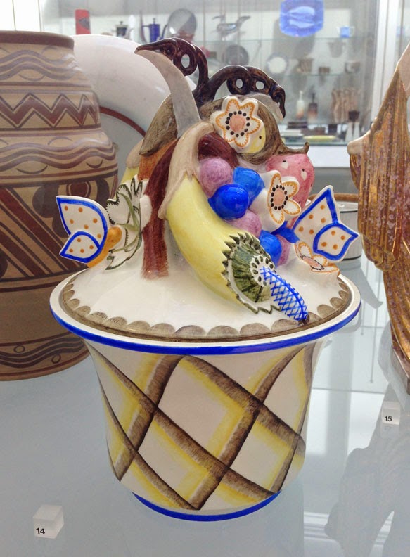
     This personal photograph does not do justice to the true colours of this earthenware jar. Amid the collection of ceramic artefacts found in this particular vitrine of the V&A (London), Sturani’s design literally ‘pops’ to the eye: from its surroundings, the jar’s bright paints appear to suck dry its peers’ murky browns and greys of any warm colours they may initially have, almost acting like a visually aggressive bully. But viewed on its own, as at first any form of art respectfully should be, Sturani’s jar boasts of a character rightfully fit for its time. Its elements echo the idiosyncratic qualities of Italy’s late Art Déco period, drawing together a bit of its neighbouring countries’ own styles (such as those of Switzerland, Austria and even Holland) and joining them with its own stylistic voice. This voice may be seen in the overall loosely-jumbled assemblage of decorative elements, giving the jar a rather elegantly ‘messy’ piled-up look, while the decorative elements themselves are Italy’s resulting interpretations of, for example, Switzerland’s folkloric marriage of colour and form; Austria’s graphic vernacular of shape; and early Netherlandish forms of tin-glazed earthenware tiles. 
     It is true that some may consider Sturani’s design as little more than a mere mélange of others’ work, but this judgement does not necessarily make him unoriginal as an artist. For his time, Sturani donated to his country his individual take on current artistic values, all the while appropriately paying homage in his designs to contemporary artistic forerunners. It was simply from the recent past that he chose to carve for himself a more defined future.

12 April 2015

Sir Alfred James Munnings

Sir Alfred James Munnings
the Hop Picker
circa 1910

     This is a glorious scene of time in a moment of rest. On this particular day, the lighting of the late sun is apparently so rich that it appears to melt the many tips of reedy bushes, its heat clumping them together into slanting, waxy masses. Coloured a deep molasses, these islands swoon with the occasional whispers of wind, their flaky leaves stemming nearer to the ground rattling with a low hum, one that seems to swim on the air like an invisible school of fish. The earth is cool and soft, pillowed with damp bits of shrub and fallen plant. To one whose mind is lethargic and heavy, the boundaries of imagination are found to be looser, and it is perhaps that for this young man these melting islands form his own protective forest. It blocks all from his mind but for the two best views of all: his immediate surroundings and, of course, the sky. Both require a scrutinisation that is indeed active, but never truly tiresome. It is here that nature entices one’s whole being best, nesting a spot that welcomes the wanderings of those wishing to be lost, if only for a while, and that forbids either persistent worry or casual idleness to keep too tight a hold for too long. What is painted here is a gateway, an impression; its entrance leads always into boundless and amicable fields, but it is an entrance that is known only to those who hold the true key to solitude.